
BLOG
Few Projects
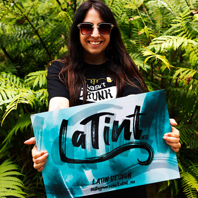
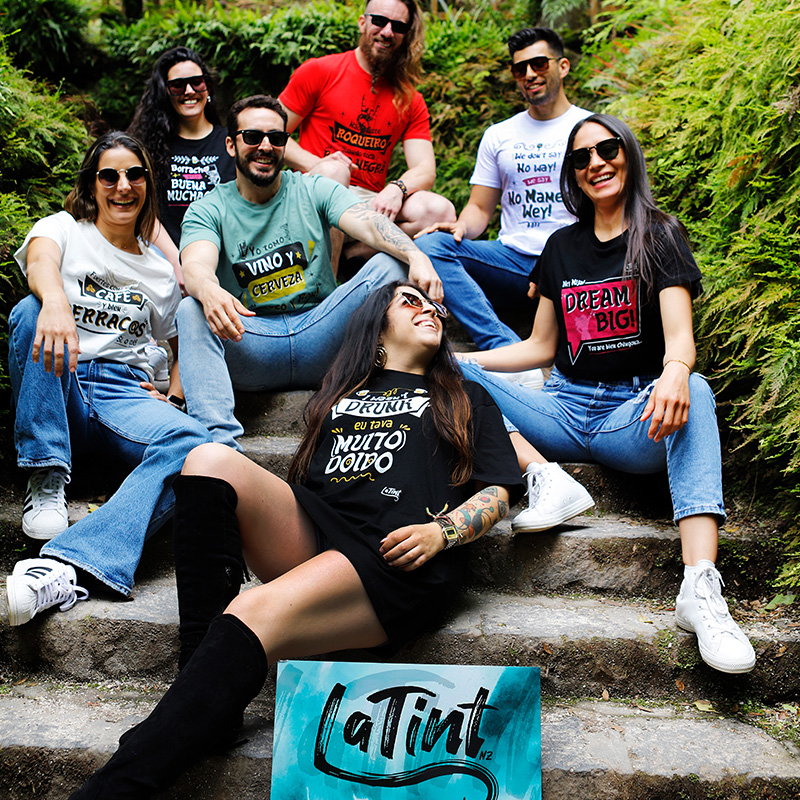
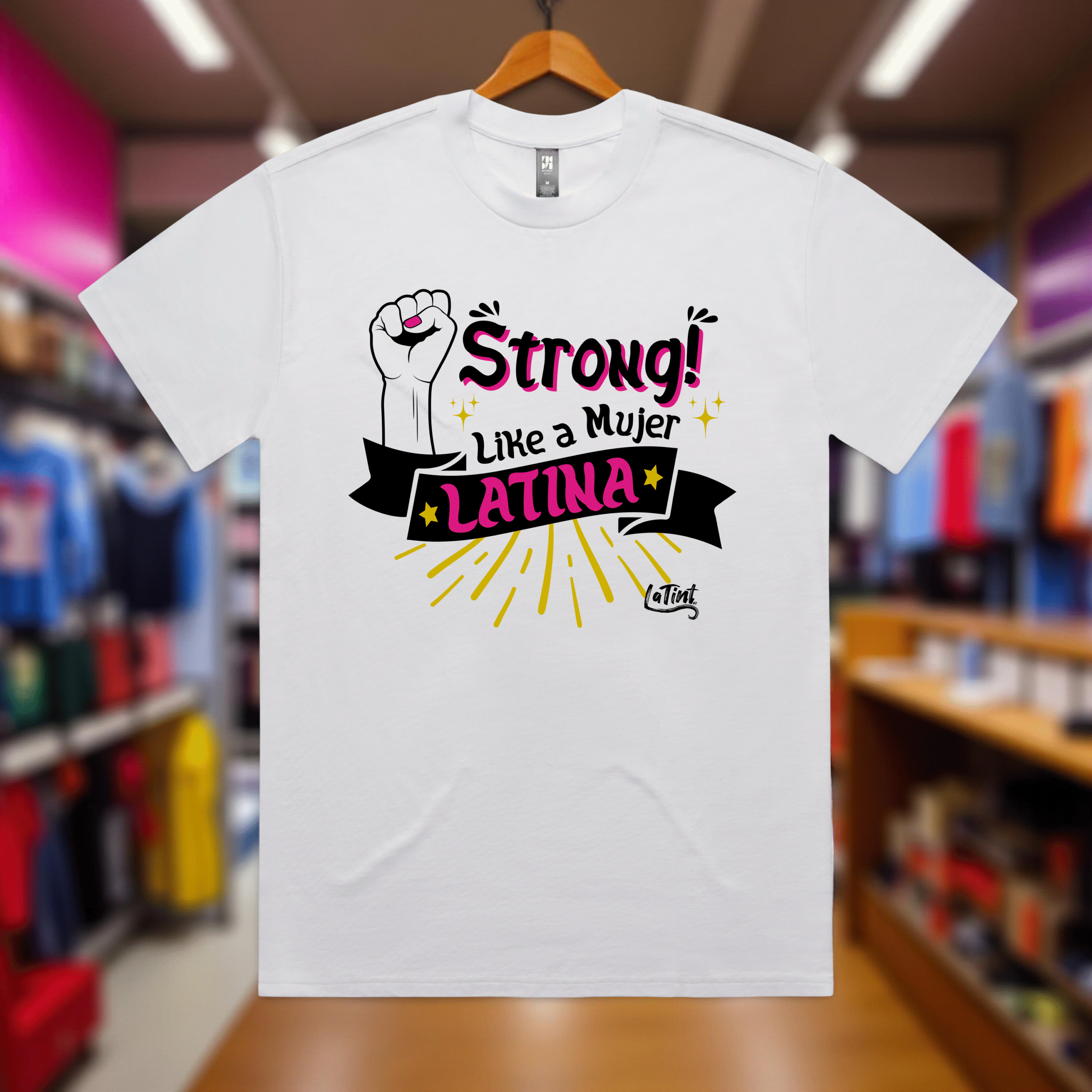
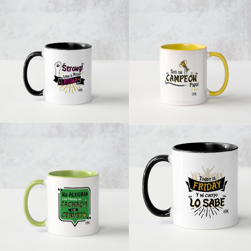
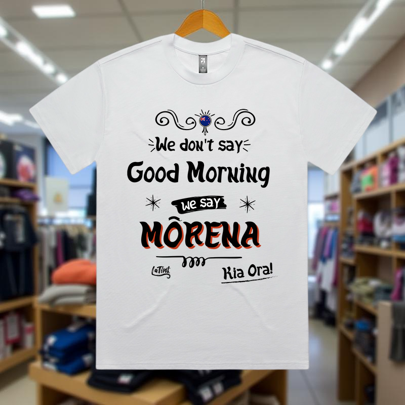
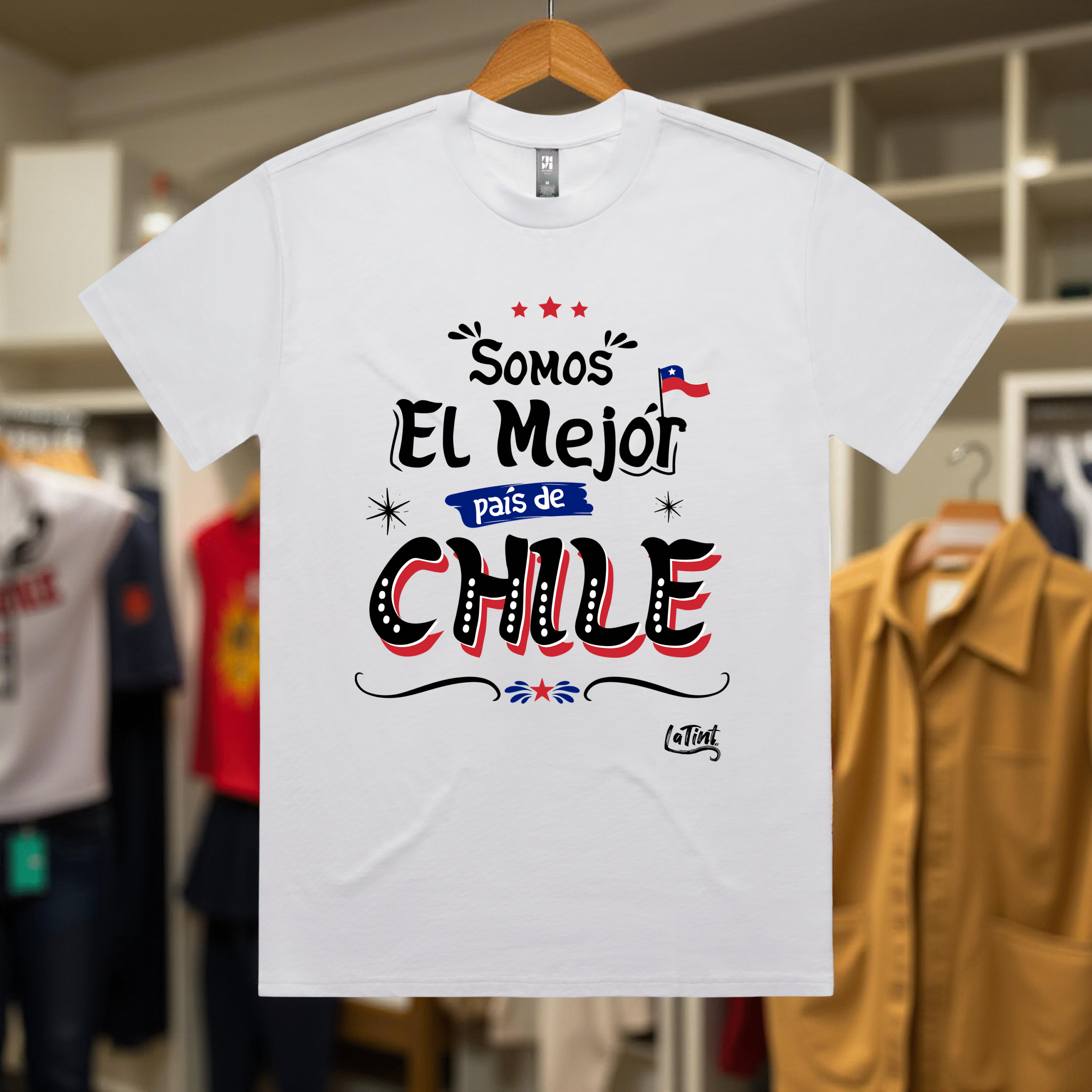
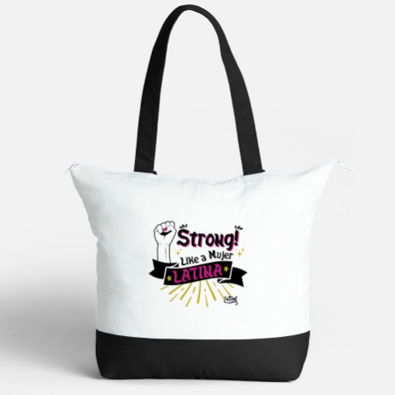
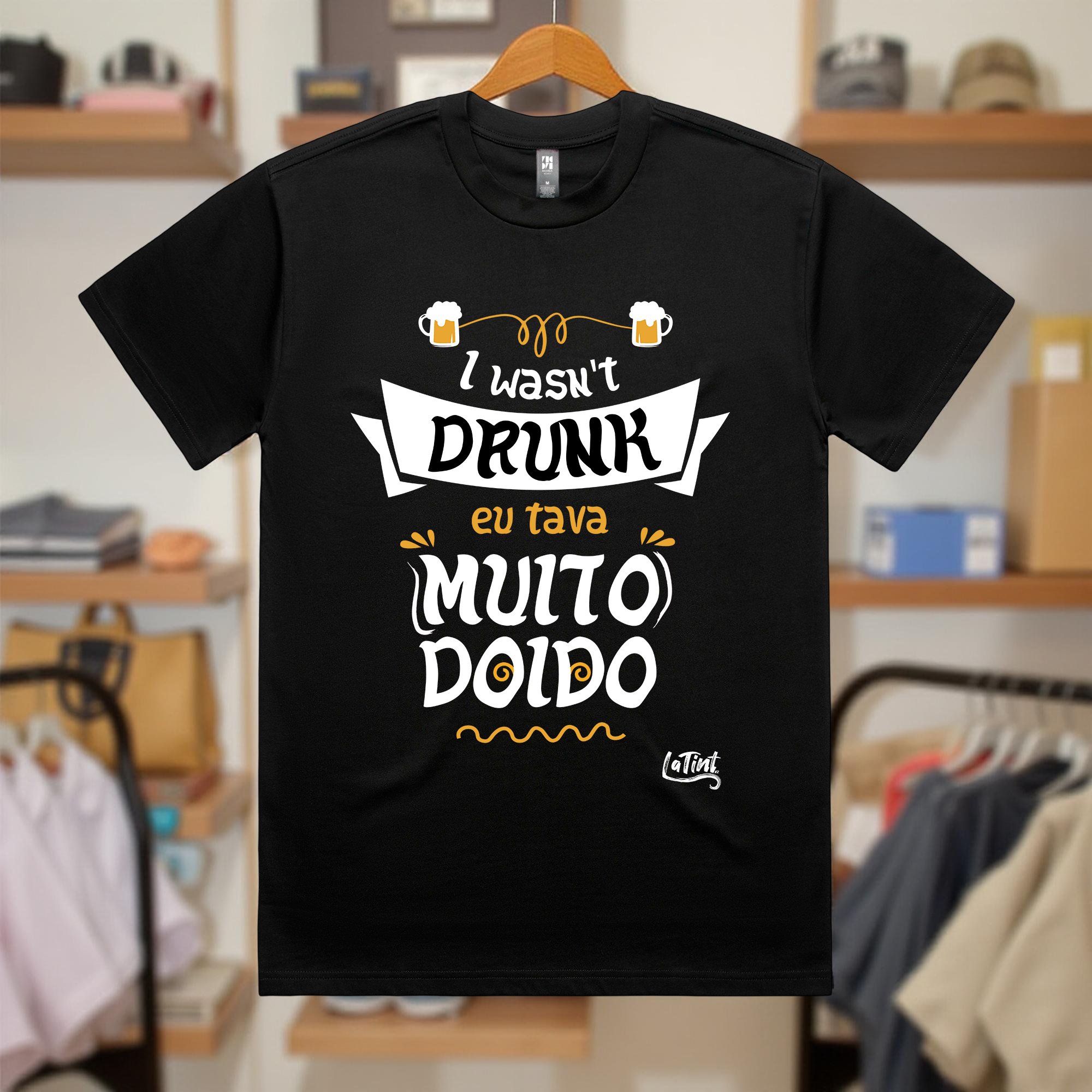
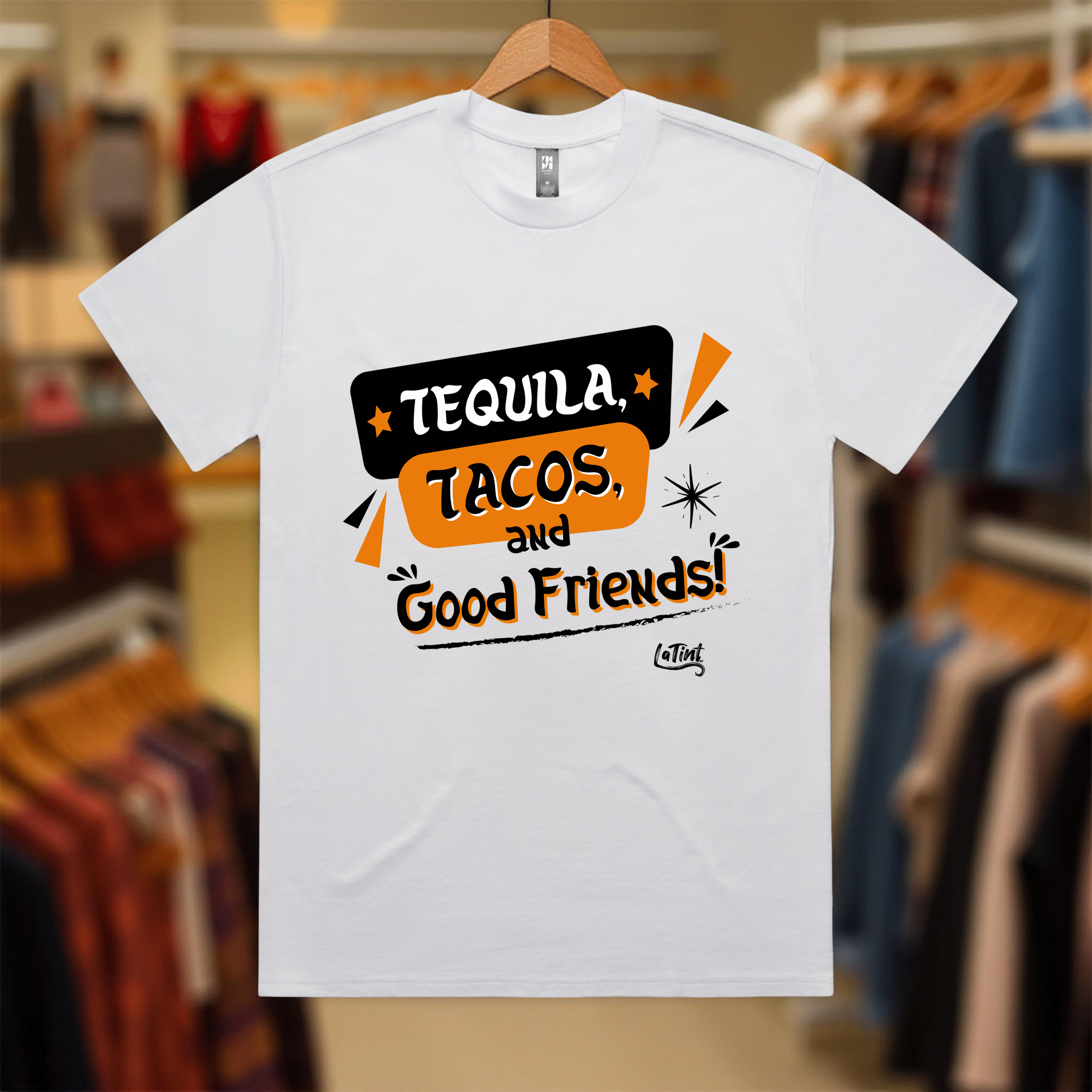
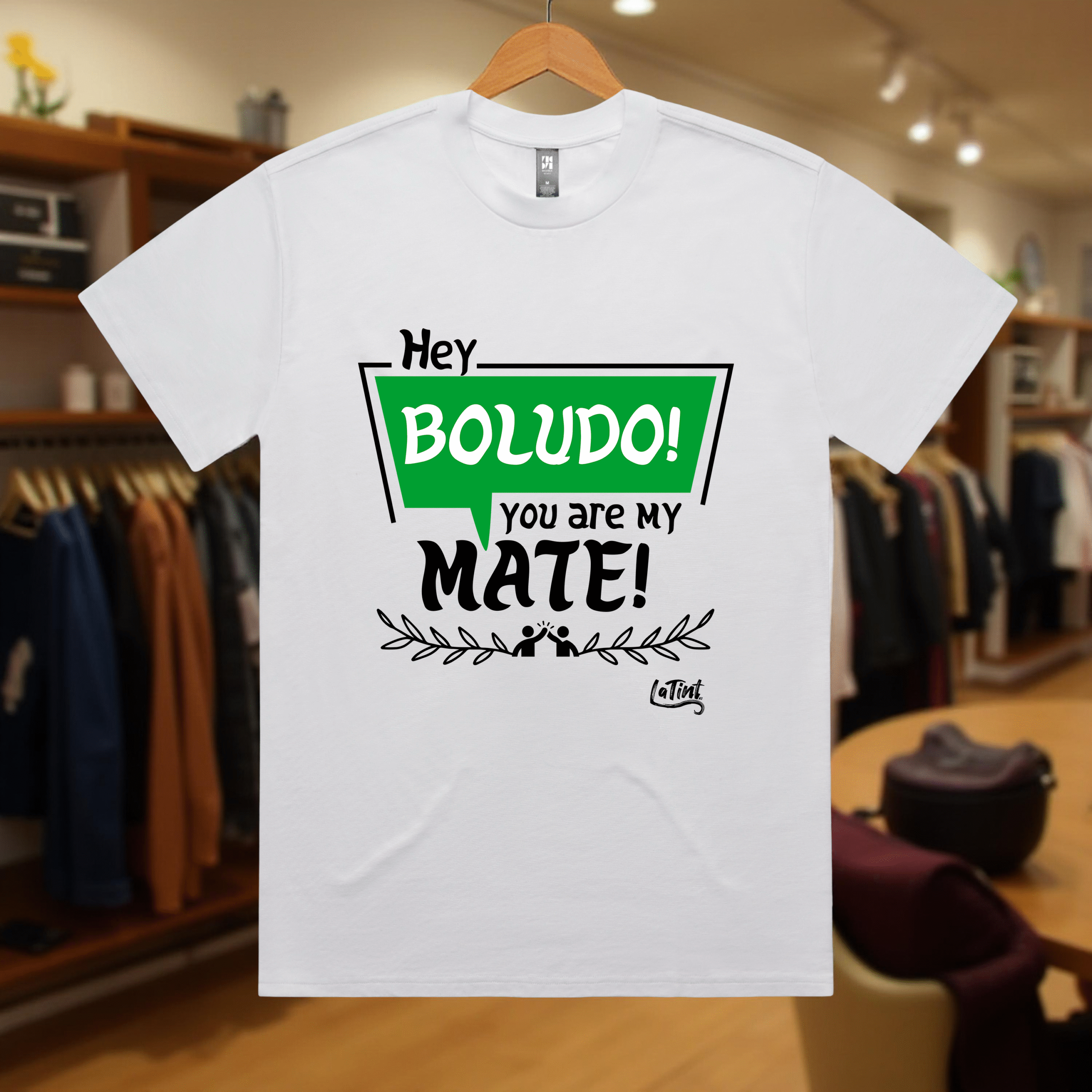
LATINT NZ
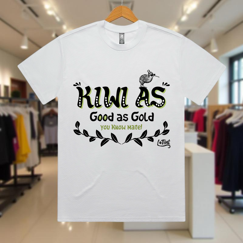
Latint NZ is a venture born from a sense of nostalgia and a desire to create a space of recognition for the Latin American community in New Zealand.
Being an immigrant is challenging, especially when it means leaving behind your roots to adapt to a new reality. However, one important lesson I learned while living abroad is that you don’t have to abandon your identity; instead, you can blend it with your new environment to create something meaningful.
With that in mind, I set out to design a product that could reflect this cultural fusion evoking a mix of nostalgia, humor, and joyful memories. I began with market research, identifying the largest Latin communities in New Zealand and gathering commonly used phrases and slangs from those regions. This allowed me to intertwine Spanish, Portuguese, and English, with plans to include Māori in the future, giving the brand even more cultural depth and versatility.
This research and creative exploration led to the creation of Latint NZ a clothing brand featuring bold, vibrant designs and popular expressions from various communities. Each piece is crafted to celebrate cultural identity while connecting people through shared language and humor.
I led the development of the entire project, from concept to execution. This included brand identity, graphic design, advertising strategy, website creation, and the clothing designs themselves.
AT MOBILE PROJECT
In the second semester of my postgraduate design studies in 2023, we were introduced to the concept of artificial intelligence (AI), its current applications, benefits, and challenges. As part of the course, we were tasked with developing a project that addressed a personal, real-life problem that could be improved through the use of AI.
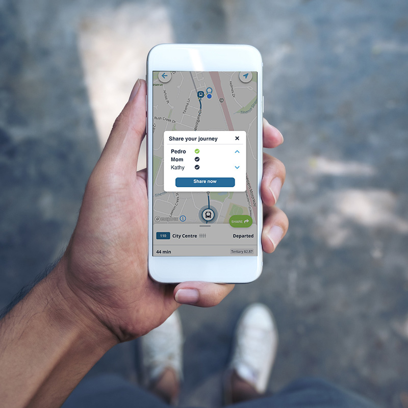
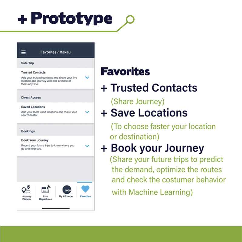
Among the issues I identified in my daily life were lack of time, rising expenses, and elevated stress levels. After analyzing these challenges, I realized that addressing just one, public transportation, could have a positive impact on the others. This led me to conceptualize a project aimed at improving Auckland Transport’s (AT) public transport app by integrating AI and additional user-focused features.
Key elements of the proposal included:
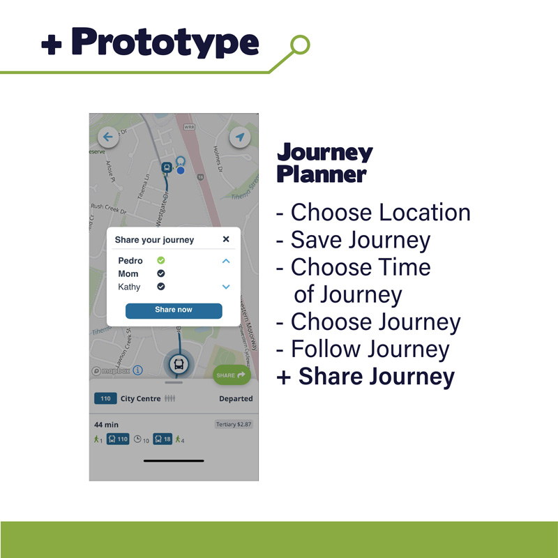
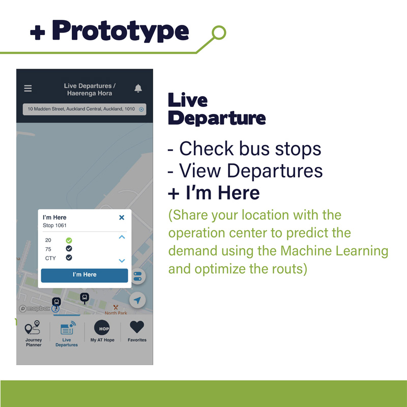
Data-Driven Service Optimization: By collecting essential user information, the system could better respond to real commuting needs. AI could analyze usage patterns to suggest improvements, such as increasing bus frequency on high-demand routes. Users would also be able to log their routine trips, allowing for more accurate service planning.
Safety Features: I proposed the addition of a ride-sharing option and a panic button for emergency situations. These features are especially important for vulnerable populations, such as seniors, children, and women. AI could help identify routes with higher incidents and enable the implementation of targeted safety measures to protect both passengers and drivers.
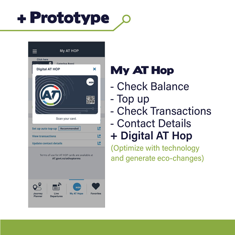
AT Card Integration: Incorporating the AT card into the app would streamline the public transport experience, offering users convenience and encouraging participation. While this feature doesn’t directly use AI, it would incentivize users to engage with the app and contribute data that benefits the overall system.
This proposal aims to increase public interest in using public transport by making it more efficient, safer, and user-friendly. By reducing unnecessary car use, it could help decrease traffic congestion, shorten commute times, lower transportation costs, and reduce stress. Ultimately, the project benefits not only individuals, but also the wider community and the environment.
HAPORI HONO
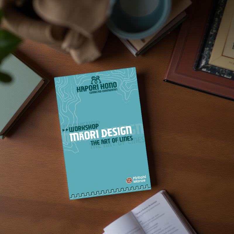
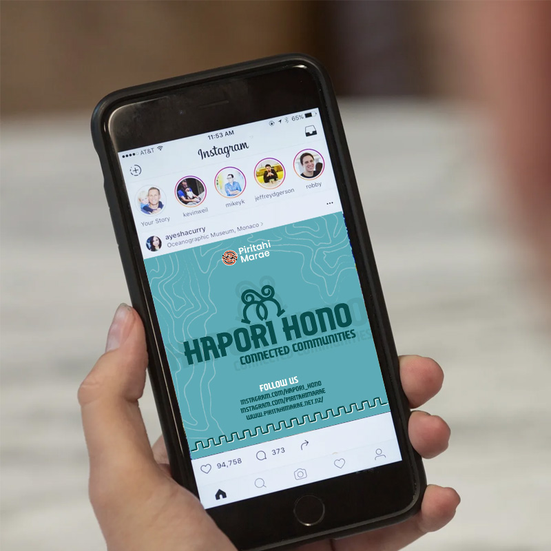
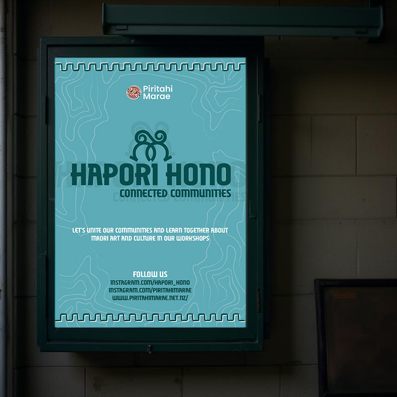
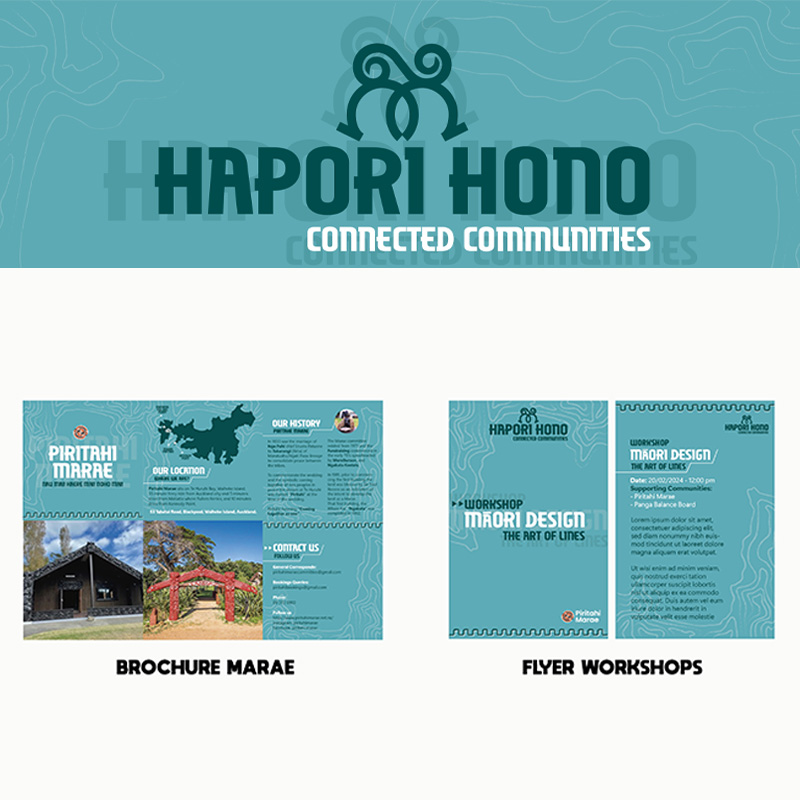
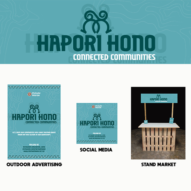
Hapori Hono was a postgraduate design project in 2023, in which each student collaborated directly with the Waiheke Marae, aiming to develop innovative ideas that would support its growth and development.
My focus was on exploring ways to expand the marae’s community, not only among Māori, but also by building meaningful connections with other island residents. The goal was to foster cultural exchange, raise awareness of Māori traditions, and create collaborative projects that could generate future resources.
The name Hapori Hono, which means “united community” in Māori, reflects the central concept of my project: identifying local communities and initiatives on Waiheke Island and developing joint workshops where both groups could share their knowledge. These workshops would serve as a bridge, gradually introducing more residents to the marae and encouraging ongoing engagement.
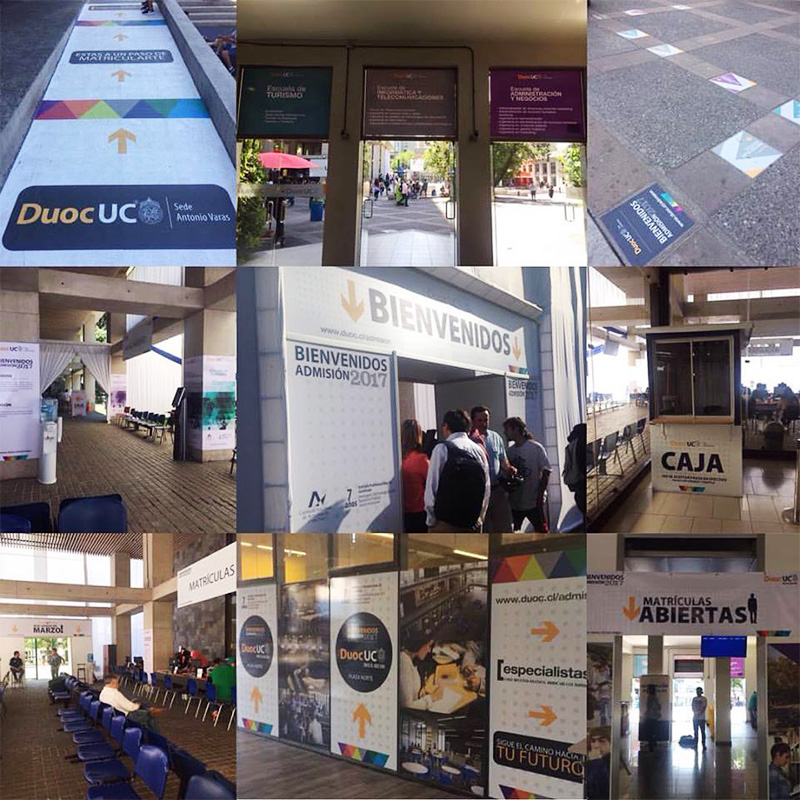
DUOC UC
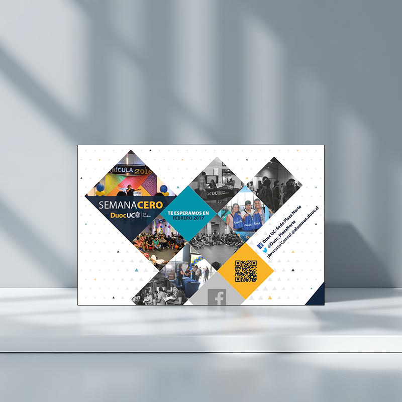

Duoc UC is a professional institute located in Santiago, Chile.
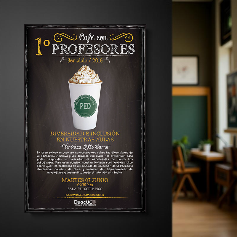
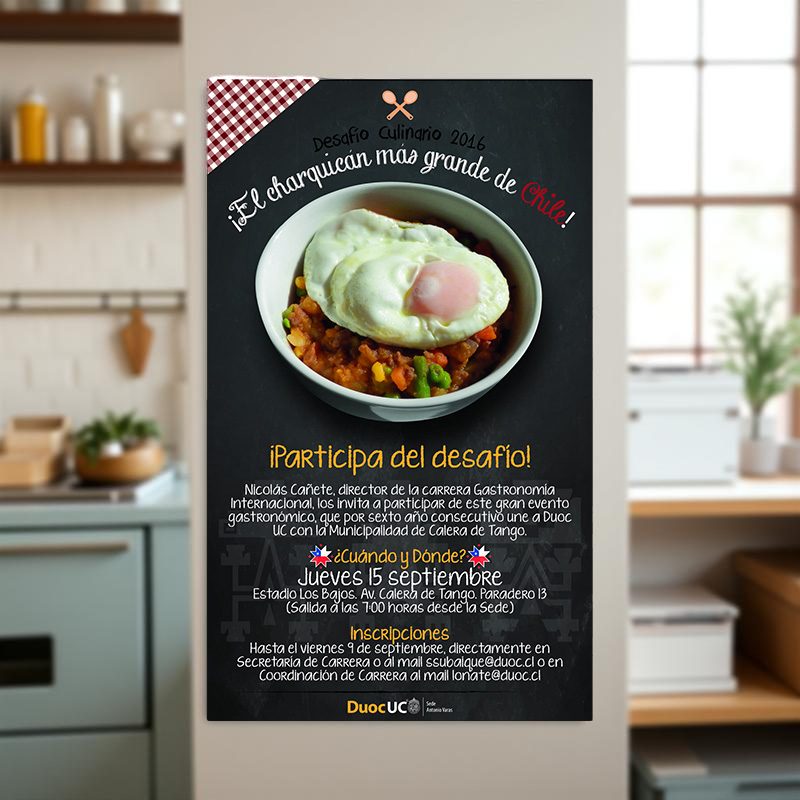
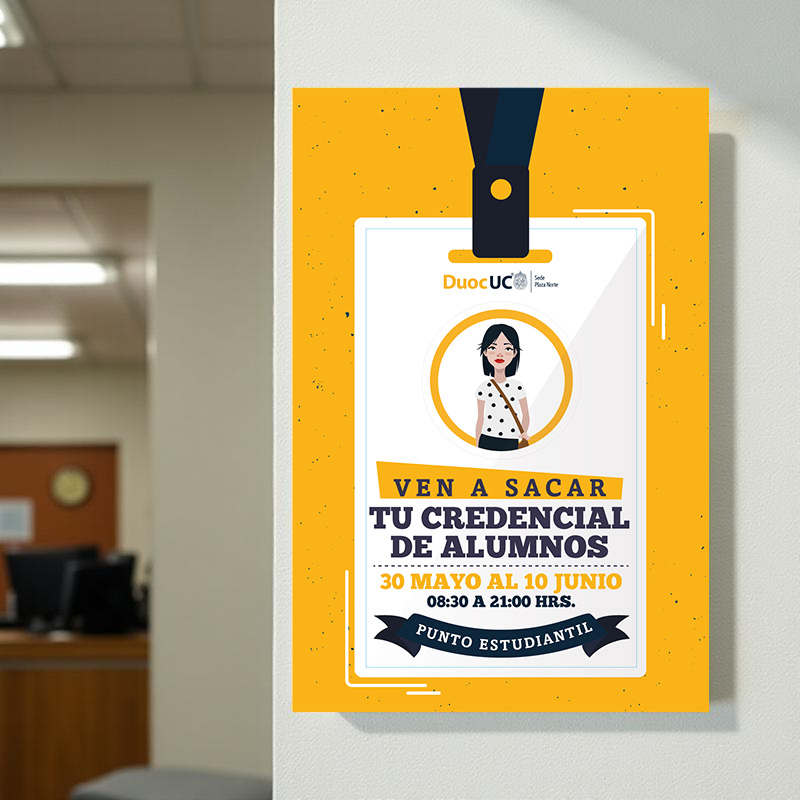
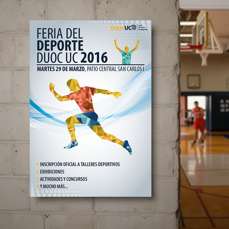
In 2016, I had the opportunity to return to Duoc UC as a creative contributor. Although it was my second educational experience, it was the first where I truly established a direct and meaningful connection with both faculty and students. As a former student of the institution, I felt a strong sense of commitment to create work that reflected the identity, aspirations, and innovative spirit of the student community.
Working in collaboration with the Marketing Department, we organized events for various academic programs and extracurricular activities aimed at both students and faculty. These initiatives were designed to foster a sense of community across the different campuses of the institution.
Later, I was given full responsibility for the 2016/2017 Duoc UC Admissions Project, where I led the development of a comprehensive design strategy focused on improving both enrollment and student retention. The approach involved modernizing the visual identity to better reflect the current student profile, fostering a sense of belonging, and celebrating successful alumni. The goal was to create a narrative that welcomed new students as integral members of the institution from day one.
The campaign was highly successful, earning a Silver Effie Award. As a result, enrollment increased by 152%, and first year retention rose by 3.1 percentage points, 28% above the national average.
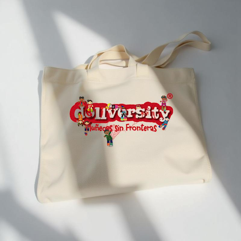
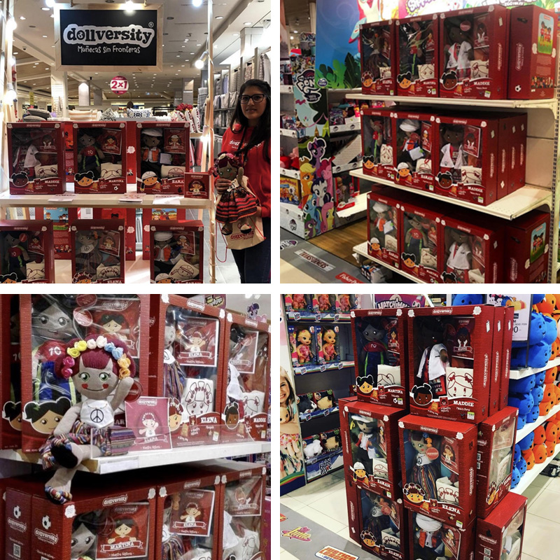
DOLLVERSITY
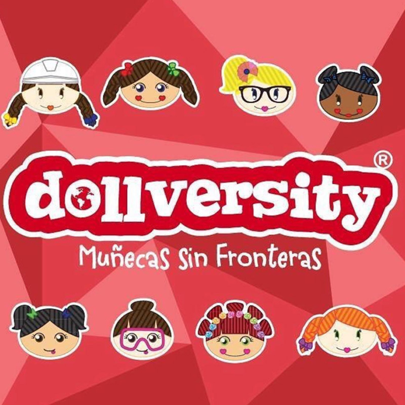
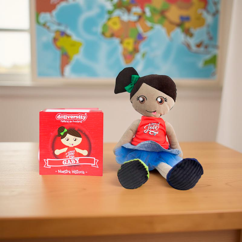
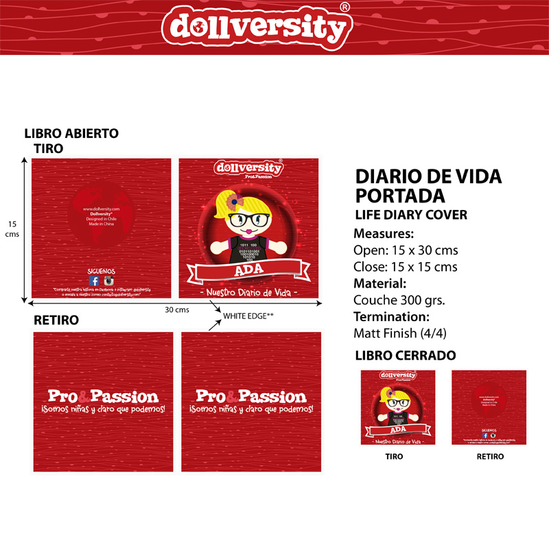
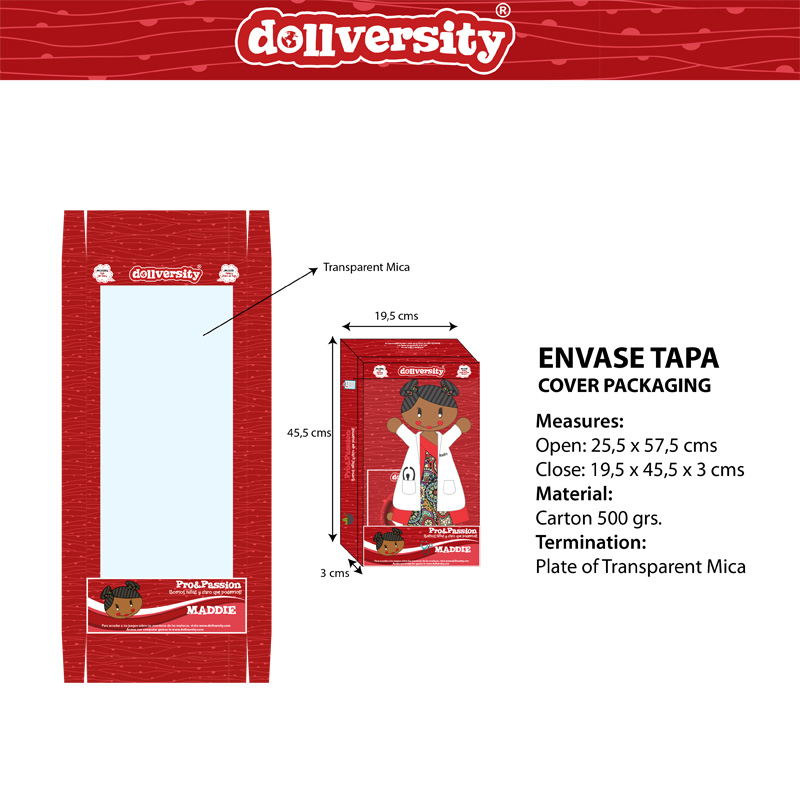
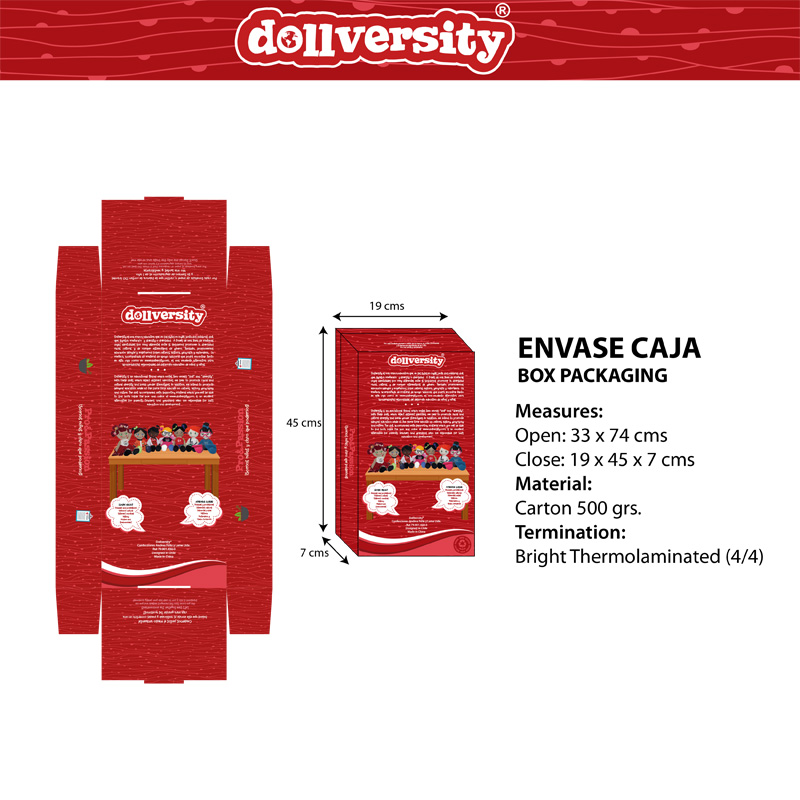
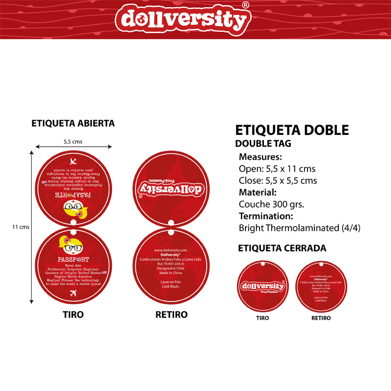
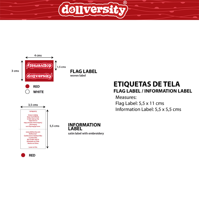
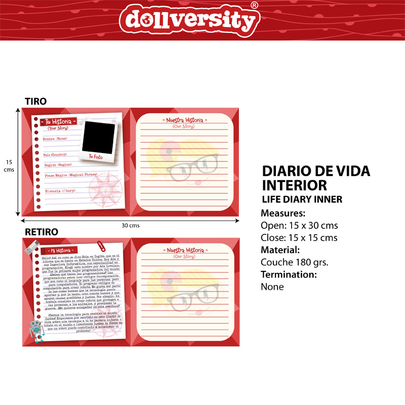
Dollversity was an educational initiative launched in Chile in 2016, aimed at challenging stereotypes and promoting diversity and inclusion. The project introduced unisex dolls designed to help children envision a future beyond traditional gender roles, embrace a variety of professions, and recognize racial diversity, particularly relevant at a time when Chile was just beginning to experience significant immigration.
My role in the project involved identifying the core concept and target audience, developing advertising strategies, and leading the graphic design process. This included creating the branding, labels, packaging, internal materials (such as books and bags), and marketing graphics for use in retail environments, social media, and other promotional channels.
CONFELIU
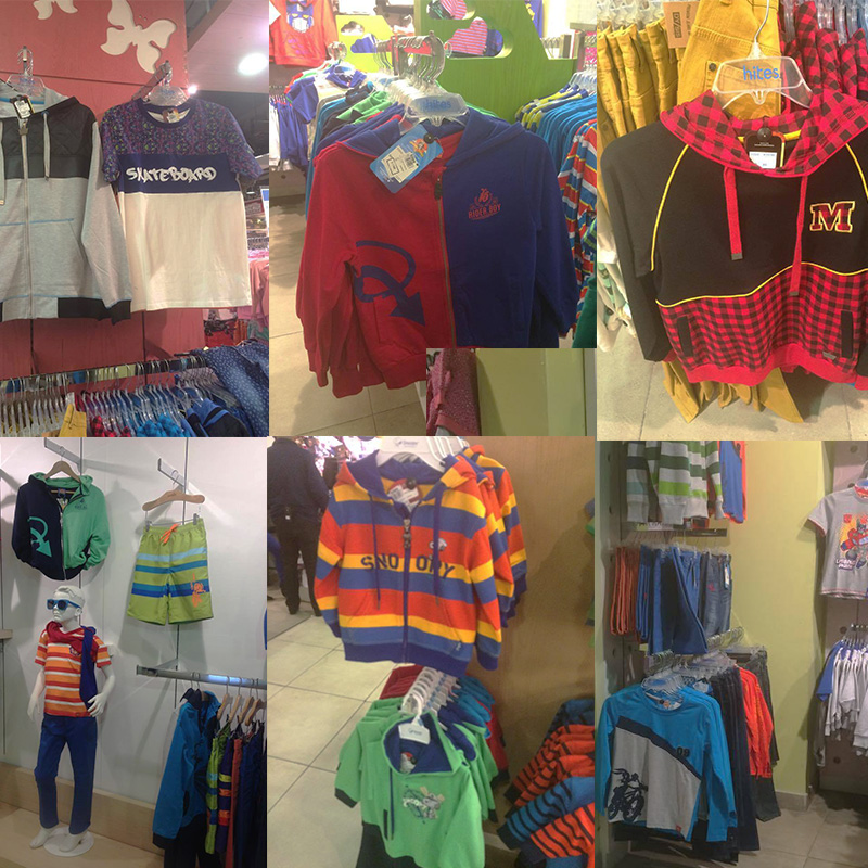
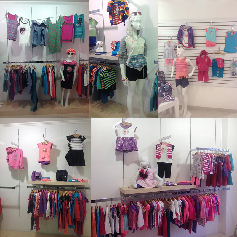
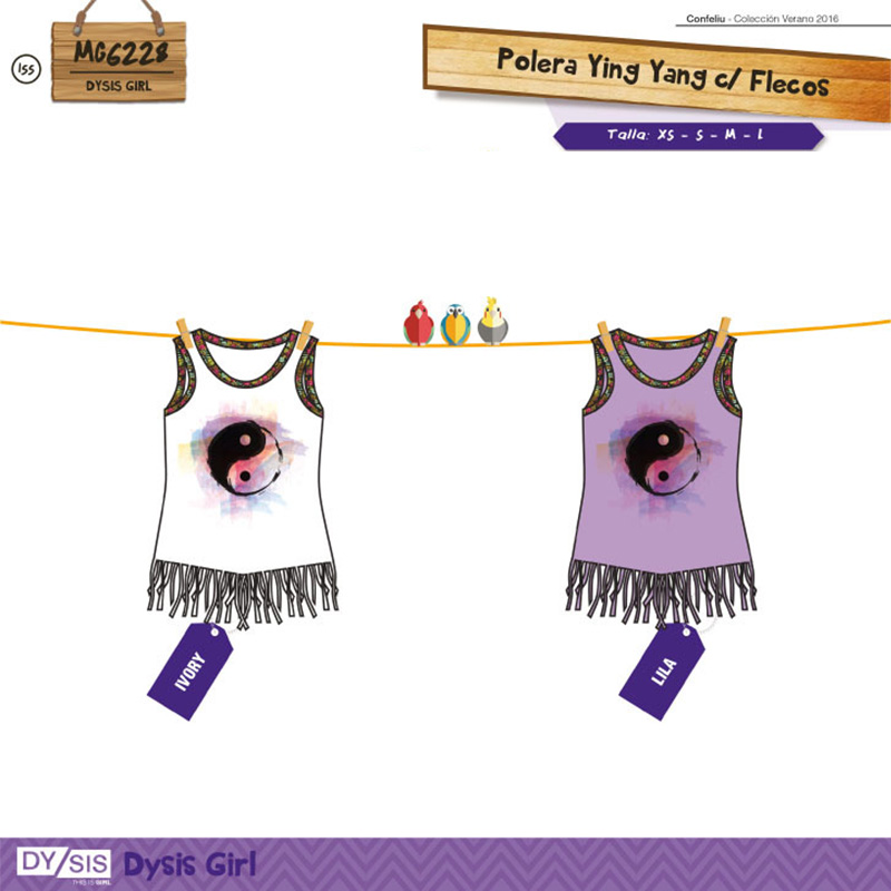
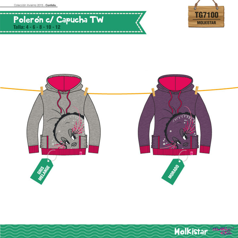
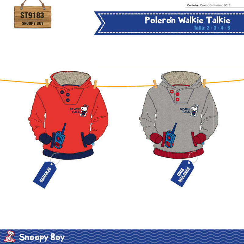
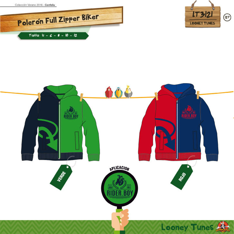
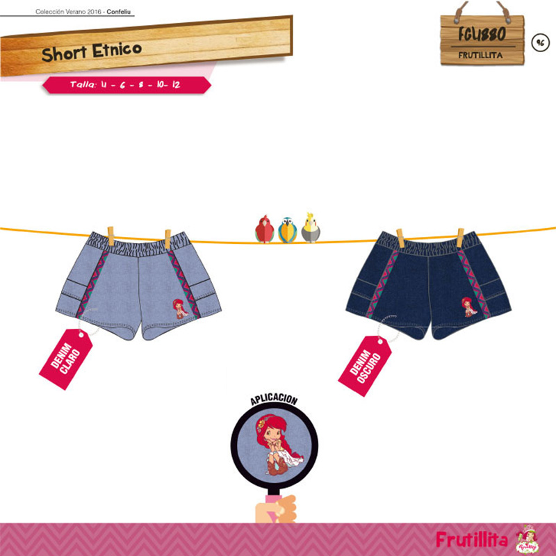
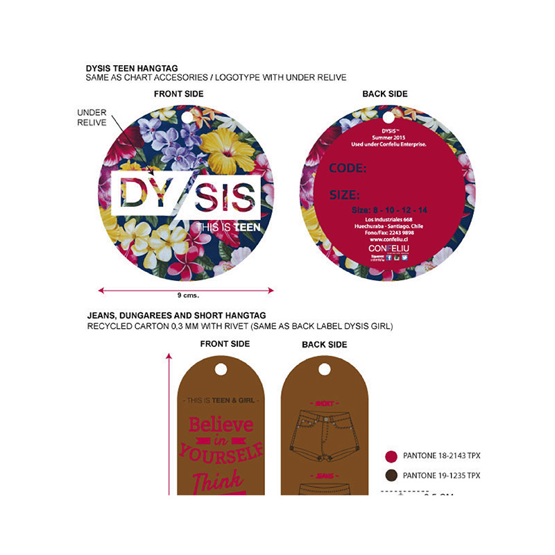
Confeliu was a Chilean children’s fashion company that featured its own brands, MLK and Molkinna, as well as international licenses including Peanuts (Snoopy), Strawberry Shortcake, NBA, and Looney Tunes.
In 2014, I had the opportunity to broaden my design expertise and gain valuable experience in the fashion industry. I initially focused on creating graphic designs for the company’s in-house apparel lines and later worked directly with international licenses to develop new concepts and visuals aligned with each brand’s identity.
As my role expanded, I took on responsibilities in technical specification development, pattern making, and market analysis skills that were essential in designing collections that aligned with both current trends and customer preferences. This experience allowed me to bridge the gap between graphic design and fashion, gaining a comprehensive understanding of the product development process.
Once the collections were finalized, I also handled the creation of product catalogs for retail buyers, as well as advertising materials and in-store graphic design to support brand promotion and sales.